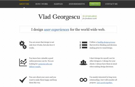
vladgeorgescu.com

vladgeorgescucom

Submitted by Vlad Georgescu, @vladgeorgescu. Designer.

Man I love this website, it’s all but just made of type. I love the little details here and there with the on-state of the navigation and the icons. The navigation in the bottom of the pages that take you on a linear voyage through the site like a slideshow is a really neat idea too. I think this type of layout could have easily been made into a single page javascripty slider type website and I just love how it’s not (not that that’s bad by default or anything), it’s simple execution with some really great design. Love it!

2 Comments

Submit a Comment

Your email address will not be published. Required fields are marked *

News & Articles

Sign-Up: Enhancing Conversions through good UX

Sign-Up: Enhancing Conversions through good UX

Optimize your website’s sign-up process by focusing on clarity, ease, and user mindset. Clearly explain the purpose, benefits, and steps, and use social proof to build trust and drive conversions.

The Essential Guide to Getting Started on Freelance Writing

The Essential Guide to Getting Started on Freelance Writing

Explore the lucrative and fulfilling world of freelance writing with our essential guide. Learn about specialties like blogging, social media, article, and technical writing. Build a portfolio, find work, set up your business, and discover the potential earnings. Embrace the freedom of working from home and follow tips for success in your dream career.