viximo.com

viximocom

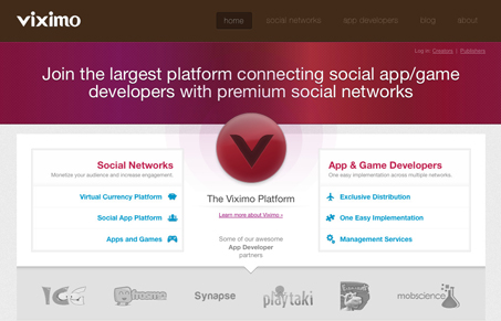
This design is cool how it uses the “V” placed in the center of the page and then have the rest of the elements aligned around it in such a symmetrical way like that. That’s clever and really makes you focus on those links, which makes the little icons even more important for visual impact. Overall the site is clean and corporate feeling and it honestly took me a couple of minutes to really figure out what it was selling, once into it the app/platform looks really cool. I just think that story could have been told faster and more completely than the current headline copy maybe.

0 Comments

Submit a Comment

Your email address will not be published. Required fields are marked *

News & Articles

Looking Fast: The Art of Website Speed Perception

Looking Fast: The Art of Website Speed Perception

In the web world, technical speed and user perception matter. By improving design for a faster appearance, you boost conversions and stand out online. Speed isn’t just loading time; it’s perception.

Designing for Errors: Creating User-Friendly Contingency Plans

Designing for Errors: Creating User-Friendly Contingency Plans

Contingency Design hinges on empathy, understanding user frustration, and transforming errors into positive impressions. By embracing these principles, you enhance user experiences, retain customers, and boost revenue in the competitive digital landscap