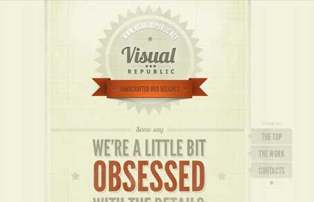
Really tight design. I love the lines mixed with the textures and the type is very nicely done. I like the fixed navigation element too, it has a cool vibe as it feels like it follows you down the page as you scroll. I’m not too hip on the name & email fields of the contact form though. I’d personally like some lines around those fields, as it is now I can see how it would be a little confusing. Overall really good looking design.


0 Comments