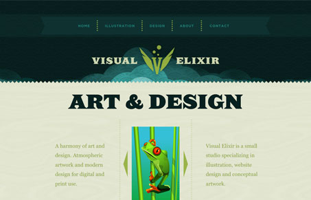
I’m feeling a bit like a hypocrite here. I’ve blasted sites for using the ‘scrolling’ feature thing when they go left to right, like a power point slide show. I’m trying to find a reason why I don’t mind it on this site, It can’t be simply because it scrolls vertically… I think I can let it slide because pages on the web typically scroll vertically so you’re not really breaking the user’s mental model of how a page works.
I do love this design. The colors are rich and seem fresh to me. The background in the header area of the site is really nice too.


I’m not sold. I think what bothers me is that I lose my menu.
For example, I click on a navigation button, and I’m bumped down the page, which is fine until I’m ready to see something else. Then I’m forced to either scroll (and I’m not sure which direction to scroll because I’m not sure what’s above or below me at this point) or use the “Top” button.
So…for me, the design is sharp, but the user experience lacking.
i like the typography work on the site,.. and graphics are very cute, good work!
Thanks for adding my site, Unmatched Style!
@Jessica Cook, I agree and I’ve updated the navigation so it works better. Perhaps it needs tweaking but it’s a step towards a more intuitive UI.
Would it be better if instead of say “top” after each section it says “up” or “top of section” or something similar?
To me “top” means go to the top of the page. Other than that I thought the navigation worked well.