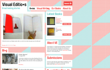
Pretty intense background patter, I do dig the effect, I just wish it was all done with much crisper graphics. I like all the boxes that all the content appears in, it’s a necessity with the strong background but it’s a nice feel.
Pretty intense background patter, I do dig the effect, I just wish it was all done with much crisper graphics. I like all the boxes that all the content appears in, it’s a necessity with the strong background but it’s a nice feel.


The Call to Action hasn’t changed in a decade, but the bar has. A fresh look at prominence, copy, mobile tap targets, and accessibility, with lessons from three major design systems.

Glassmorphism brings transparency, depth, and light back into modern UI. Learn how this “frosted glass” design trend enhances hierarchy, focus, and atmosphere, plus how to implement it in CSS responsibly.

Brutalism in web design rejects perfection for authenticity. Stark grids, raw type, and honest structure create interfaces that feel human, intentional, and impossible to ignore. Break the rules, on purpose.
I have to disagree with the blurb above. This site doesn’t really have a nice feel to it. It has a 1980’s MTV in your face feel to it.
The About and Home copy promote books that are “visually breath taking”, which I have to say they really are, but the site does not reflect their general motto.
Er, let me take that back, they produce a visually striking site that distracts the user, when it should engage them.
The background is just too intense, and too loud and the layout was scattered and hard to discern. I mean, I know what they were going for but I don’t think it was looked at with that editoial mindset. If they would have used that background patters (which changes by the way from bright pink / blue to green / pink)
in a more sutble fashion, maybe as a rollover effect to highlight content? Or as as funky border to separate elements? I feel it would have been way more effective in creating a visually interesting layout and calls to action.
I really hate to bag on designs because I too have produced some doozies in my day (and still do) but this site has so much potential to be great that I just had to comment.
If they can edit down, re-work, and pare down some more of their design, this site would rock and would really highlight the books they were tyring to promote. Maybe they will even entice me to stick around and buy one of their books too 🙂
That 1980’s vibe is what I liked most Isacc. I agree with you mostly though, the execution is lacking, but the overall vibe is what I like most.