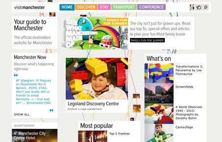
An interesting review here, we find that Jay and I disagree a little on this site design. Here’s our comments:
Jay
This site, while at first seeming a bit minimal and restrained, has a lot of gimmickry going on which really detracts from the content and usability. There are two main things that happen, one when you scroll is that the navigation follows you, and two, when you click on something you get a loading bar, then it zooms down the page. Both of these are unexpected behaviors that do not add to the utility of this site and contribute to the overall feel of groundlessness that the user gets while navigating. By having a navigation that moves and a page that scrolls, when I’m taken to the new page, I’m not really sure where I came from, especially since I can see peeks of stuff above and below. I’ve quickly lost the ‘scent’ of where I was. Perhaps some of this could be mitigated by a tighter grid, as it is many of the elements seem misaligned. I assume this is intentional but it contributes to an overall feel of disorganization.
Gene
I find the uniqueness of the design to be refreshing. I don’t find that the javascript effects, the fixed navigation the scrolling, etc… detract from the design or my ability to take in the content. For me it’s the lack of visual hierarchy that has more of an effect on scalability of the page than anything else. I think it’s the content being placed in the white boxes that make it all seem like it’s on the same level of importance.
I like the fixed navigation and how for this specific site it follows you and fades in once you get to a particular section on the page. I also really like the background and how it draws in as you load the site for the first time.


I guess I’m in between the two arguments some where because I do feel that the site has a disorganized impression which gives it a unique feel (background and such) but if I’m visiting Manchester I might need to be able to quickly get an impression of the city and vital tourism information. Gene’s suggestion of creating more visual hierarchy would probably create more of a balance between trying to stand out and make an impression while still offering large amounts of information quickly.
As for navigation, I agree with Jay because I was put off by the way it added onto the bottom of the homepage rather than opening a new one. This could also be solved with better visual hierarchy – what if that section had a different background altogether?
I’m all for trying new things and being unique but when it’s a tourism site you have to remember you main objective.
I don’t mind the fixed nav menu, but I don’t like how it momentarily disappears when you manually scroll up or down. A user might not notice its re-appearance because the delay is a couple of seconds. I find the intertwining, multi-colored lines in the background to be distracting as well. I know that the misalignment of content blocks is intentional, but it makes the overall page look too messy for my liking. I think that a greater color contrast between the background and content blocks would make the site more readable.
I appreciate the originality. But, this site has no visual hierarchy. I’m lost upon first load, and don’t even bother to use the navigation. Interesting concept, poor solution.
I’ve weighed in in the original post, but yes like Ken says, the main thing is the lack of hierarchy. I think that would make the site 95% better.
You guys should try this site with javascript turned off. It actually functions much better. No sliding around, and when you choose a link, you go to a different page. Wonders. It’s also much faster, since a lot of that animation and fading makes the site artificially slow. So if they lost the javascript effects and added a little more structure it would be much more successful.