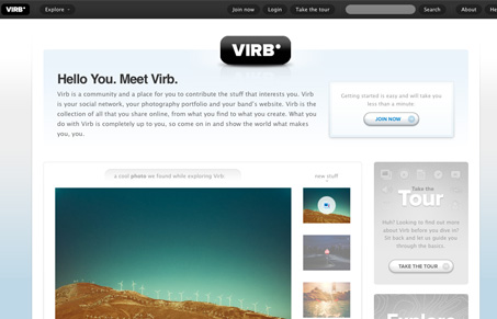
This site is so chock full of fine details and great layout I don’t even know where to start. This could be an epic post, i’ll keep it quick here (maybe we’ll do a full app review one day…). Now I know it’s not a new design, that’s its been around for a while now, but I love it and wanted to link it up in the UMS gallery. They also have a great post on what the deal with the relaunch is.
I love the visual rhythm of this layout as you scan down the page, and the detail work in all the little widgets and buttons makes me feel like this is the site all the tutorials about how to make the cool buttons comes from. The stats area across the bottom of the page is very well done and I just enjoy looking at the numbers.
The join form is immaculate, it’s a clinic on how to layout a quick, easy to scan and simplified join form. Study it with detail is all i can say.


Thanks again, guys!