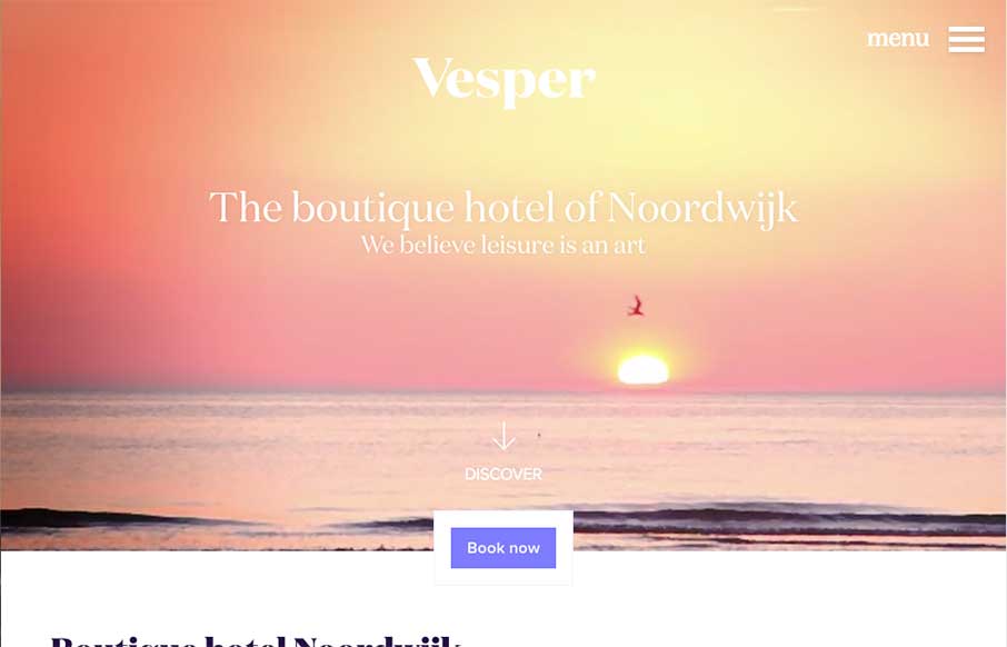
I really like the way the “departure” and “arrival” search is placed. It’s front and center, very good UI. I also dig the way the images reveal as you scroll down, normally I don’t like that kind of treatment too much but it works well here to me for some reason.
Submitted by: Joost @krijnenbeebie
Role: Designer
This is a great website that combines great immersive brand experience, with good usability. The animations are nice and subtle the videos really make the site come to life. All the copy and photography is really specific and consistent, lots to love.


Lots of lovely stuff on this site:
– Percentage based height on the hero/banner image.
– Use of “Domain Display” font for headlines
– The way that the availability checker sticks to the header on scroll feels useful rather than gimmicky
– The subtle effects as you scroll
– The way that the contact details stick to the bottom of the screen on the mobile menu
– The layout is quite brave too – the way the text and images are laid it is almost messy but nice to see something different
I like that availability checker the most myself Matt.