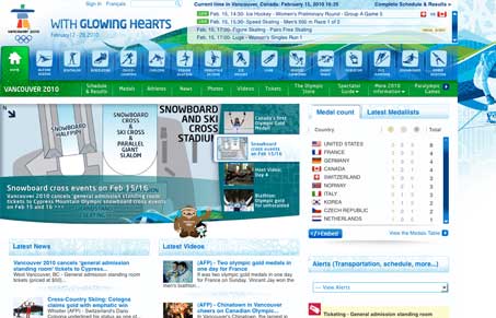
Jay and I seem to disagree, hear it all in the screen cast. Overall Jay thinks it’s well done and I think it’s overwhelming. To be fair any Olympic site has a ton of content to deliver and it’s a huge undertaking for sure.
Visually speaking, look and feel wise, we agree, it’s really nice and has some good detail and the illustrations are wonderful. I’m responding to the content organization mostly, there seems to be less hierarchy than there could be. Especially as you move down the page, below the fold of the page. Jay generally disagrees. Overall it’s worthy of the gallery regardless of whether Jay or I agree.


Definitely not a fan of anything left justified. Pixel fonts are out. Colors are amazing. Illustrations are great. A lot of the fonts on the images don’t seem crisp. A lot of content, but not everything can be a minimalist design portfolio, especially something like the olympics.
This thing is really busy. It reminds me of Microsoft Office Ribbon on the PC.