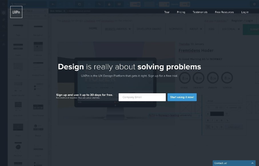
“Design is really about solving problems” – Amen. I can see that UXPin’s philosophy, matches the way they go about their design for their site too. Love the simple home page, that is still layered with a video background of the product, but more as texture than a main feature.
What I really like is the Tour page. This is scroll jacking, but again, it has purpose, and is less invasive than other’s you’ve seen. It’s a good compromise between form and function, and well, function (UX and marketing functions). I like this company too, and should probably be using their product more – it looks like it’s grown since I last used UXPin.


0 Comments