utah.gov

utahgov

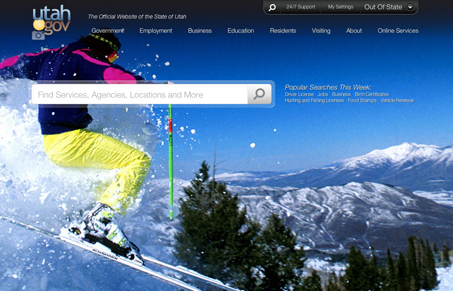
Really interesting site design. With the large stationary background image serving to give the only real visual that would inform you about Utah (skiing), it’s bold. Then there’s a fixed top and footer navigation layout centered around what appears to be the main desired mode of interacting with the site’s content – the keyword search. I’m not 100% sold on that being so heavily focused on visually.

There are some pretty nice design treatments here with the ‘mega dropdowns’ in the header nav. Then there is the extra stuff that slides up from the footer that’s pretty well done. Overall i’d say spend some time on this site looking over all the details, it’s pretty good for that stuff.

2 Comments

  1. ross

    not a fan at all…..feels like 1997

    Reply
  2. jerry

    yeah no kidding. and what is with that logo utah….Come on!

    Reply

Submit a Comment

Your email address will not be published. Required fields are marked *

News & Articles

Looking Fast: The Art of Website Speed Perception

Looking Fast: The Art of Website Speed Perception

In the web world, technical speed and user perception matter. By improving design for a faster appearance, you boost conversions and stand out online. Speed isn’t just loading time; it’s perception.

Designing for Errors: Creating User-Friendly Contingency Plans

Designing for Errors: Creating User-Friendly Contingency Plans

Contingency Design hinges on empathy, understanding user frustration, and transforming errors into positive impressions. By embracing these principles, you enhance user experiences, retain customers, and boost revenue in the competitive digital landscap