urbanoff.com

urbanoffcom

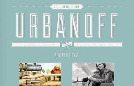
There’s a lot to like on this site. The big chiseled type logo is really well done. I also love the ‘back/next’ navigation links on the work pages. The monochrome color scheme works well too, and helps the large portfolio screenshots stand out. It would be nice if there was an different design for the subpages. The huge logo is a good first impression, but once we’ve seen it, it would be better to focus on other content on other pages. Overall, this is a very nice site that should have a little more time spent on it to be fully complete.

0 Comments

Submit a Comment

Your email address will not be published. Required fields are marked *

News & Articles

Looking Fast: The Art of Website Speed Perception

Looking Fast: The Art of Website Speed Perception

In the web world, technical speed and user perception matter. By improving design for a faster appearance, you boost conversions and stand out online. Speed isn’t just loading time; it’s perception.

Designing for Errors: Creating User-Friendly Contingency Plans

Designing for Errors: Creating User-Friendly Contingency Plans

Contingency Design hinges on empathy, understanding user frustration, and transforming errors into positive impressions. By embracing these principles, you enhance user experiences, retain customers, and boost revenue in the competitive digital landscap