
Submitted by: Mårten Björk @upperdog_se
Role: Designer & Developer
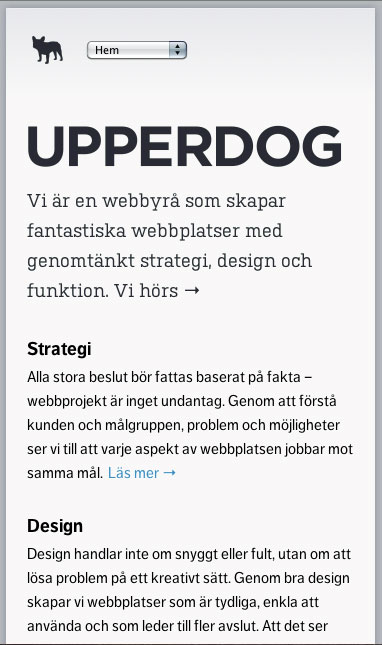
Me and my colleague made this site using HTML5, CSS3, SVG and responsive design. It’s for our new business – a web agency called Upperdog.
Honestly, I was ready to pan this as being too plain and uninspired. But then I clicked around a bit and it really grew on me. It is very simple, but has just enough cleverness to save it. For one, check out the iPhone graphic as you scroll down. Pointless but fun. The layout is very structured and consistent and has a good rhythm and hierarchy. The site is also responsive. It’s an interesting way to handle the navigation by switching in a select box. I’m not sure that’s the best choice, but it works. It’s a shame that they lose the images for smaller screens, since without them each page is identical and is just a series of blocks of text. Responsive design isn’t just making stuff ‘fit’ on a smaller screen. If you lose what is fundamental to the complete site, you’re also losing a part of what might make a design compelling and effective.


0 Comments