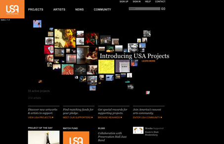
There is a lot of neat interface work done on this website. From the US map on the home page made up of images to the side scroller on the projects page, it’s engaging in both it’s layout and interactions. I’m not totally wild about the black background, it seems to make the pictures look more intense and jumbled because of the stark black juxtaposed with the vibrant colors of all the photography. I do however really like the layouts of all the pages, particularly the multi column sections as you scroll down the page(s). Really interesting site here, worthy of digging through I think.


0 Comments