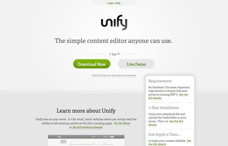
Great looking minimal feeling design for the Unify website. I love the simple columns that flow into each other and the way the far right column/blocks of stuff overlay the page sections gives it a really nice sense of dynamism. It’s an adaptive layout too which makes for a nice experience when you resize the site. I wonder if the app itself is adaptive too?
Glassmorphism: The Transparent Design Trend That Refuses to Fade
Glassmorphism brings transparency, depth, and light back into modern UI. Learn how this “frosted glass” design trend enhances hierarchy, focus, and atmosphere, plus how to implement it in CSS responsibly.


0 Comments