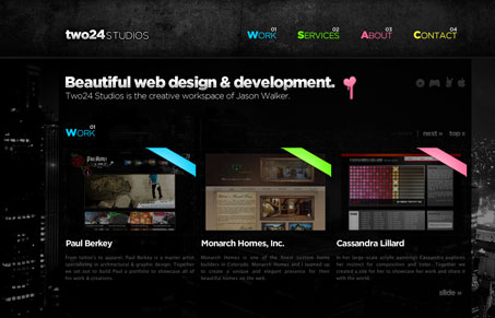
This site is visually really well done. I love the textures and the effects done to the main section headers. The dark background makes this design look a bit evocative to me and I really like the rounded corners tucked away on some of the less important elements like the form fields. I’m not sure how I feel about the ‘scrolling’ aspect of the site. It’s a neat effect but these types of treatments are starting to feel really trendy to me. What do you guys think about that?
Glassmorphism: The Transparent Design Trend That Refuses to Fade
Glassmorphism brings transparency, depth, and light back into modern UI. Learn how this “frosted glass” design trend enhances hierarchy, focus, and atmosphere, plus how to implement it in CSS responsibly.


Hey thanks for the post 🙂