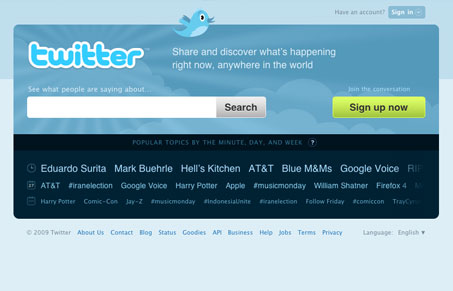
Can’t remember the last time I even went to the twitter.com home page, probably the last time my session expired, it’s been a while. To see this new home page launch really gets you going.
I think Biz explains the reasoning behind the re-design best in his blog post when he says:
Defining a “tweet” for the uninitiated and explaining how to create an account doesn’t resonate with everyone. “Why would I want to do that?” is a common reaction. However, demonstrating the power of Twitter as a discovery engine for what is happening right now through our Search and Trends often awakens a sense of wonder which inevitably leads to a much more compelling question, “How do I get involved?”
Personally, I love the simplicity, it’s the google simplicity approach, putting the search front and center is a very strong move. Has me wondering why they just got around to it. And the clear call to action “sign up now” next to it is great placement. Then the hashtag list thing at the bottom giving visitors a taste and quick links really drives the power of twitter search home.
Update: Gary Vaynerchuck on Twitter’s redesign:


The playful visuals suit the Twitter brand and I agree that the stripped-down layout serves the puprose of the site very well. The site almost makes me want to join the Twitter craze.
There isn’t anything about the design’s aesthetics that makes me envious, though. It’s one of those designs that only works becasue it’s paired with a product/service that’s known for it’s total simplicity.
A couple of minor usability issues that I have are the inconsitent use of similarly styled icons (i.e. one is basically a tooltip but the other three are just decoration) and the faded topic phrases (i.e. I had wrongly expected to be able to click them or at least scroll rightward and bring them into focus). One thing that puzzles me is why language-selection is placed at the bottom of the page.