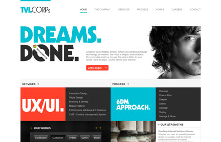
This website is an elegant site with well a ordered aesthetic: emphasis is placed on simple trusty sans-serif typography and whitespace. A judicious use of color livens the space and provides a simple road map to content at the top of the visual hierarchy.


0 Comments