
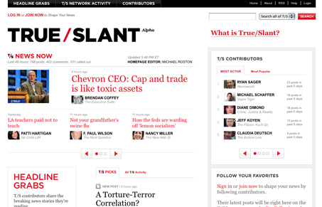
Really nice text-heavy design. This site comes across as simple but it is quite large and sprawling with it’s content. It employs color to highlight active areas and has just the right amount of spacing between items to not make an otherwise extremely text-heavy design be visually overpowered by the copy.


Fitts’s Law: Why the Easy Button Wins
Large, close targets are faster to hit than small, distant ones, that’s Fitts’s Law. A look at the 1954 rule behind buttons, prime and magic pixels, thumb zones, and dark patterns.


I see your points about how well they handle the large amount of content on this site but I do wish it were more friendly to the newcomer. Why can’t the link that says “What is True/Slant” give just a little bit of info about the aim of the site?
There’s no contact page here so I’m using the comments…
FYI,
I see that in your RSS feed you use Google Analytics tracking on your links but the tracking is also added to the outgoing links and sometimes causes 404s on the site I’m visiting.
@joe – thanks for the heads up there, we’ll check it out.