trikoder.net

trikodernet

Really unique layout, the squares that have the roll over effect all over the background of the site are a neat touch, even if they are fairly useless. Sometimes when you put something into the design like that it just gives the design a nice feel when it’s used, that’s it and it’s enjoyable in this instance. I also really like that they elected to make each page a unique loading page and not do a slideshow type website. That may have really been too much for this design but in this case it’s restraint that makes it work out well and that can be hard to do. Sweet use of @font-face and the interactions are all perfectly done.
trikokercss

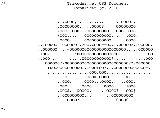
Bonus is the octopus ascii art. Awesome!

0 Comments

Submit a Comment

Your email address will not be published. Required fields are marked *

News & Articles

Sign-Up: Enhancing Conversions through good UX

Sign-Up: Enhancing Conversions through good UX

Optimize your website’s sign-up process by focusing on clarity, ease, and user mindset. Clearly explain the purpose, benefits, and steps, and use social proof to build trust and drive conversions.

The Essential Guide to Getting Started on Freelance Writing

The Essential Guide to Getting Started on Freelance Writing

Explore the lucrative and fulfilling world of freelance writing with our essential guide. Learn about specialties like blogging, social media, article, and technical writing. Build a portfolio, find work, set up your business, and discover the potential earnings. Embrace the freedom of working from home and follow tips for success in your dream career.