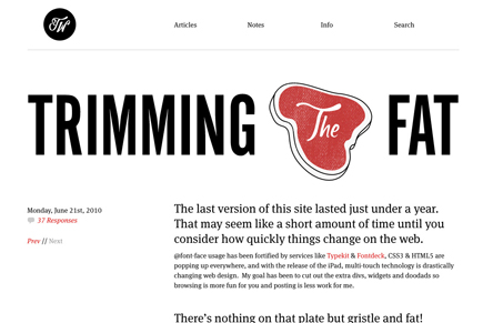
We’ve featured Trent’s work on UMS before and he’s also one of the guys behind Design Swap. Trent’s blog has always been minimal and content focused and with this newest design update it’s even more so. Each post will bring a slightly different look to Trent’s blog. So you should really go back through all the past posts to get a true sense for what he’s done here.
The site sits right on the line between an exercise where each and every blog posts brings a different look and feel to the site and a nice clean framework to do that but not 100% of the way. I actually love that, it’s a workable solution that should allow the author to focus on writing the content of the post and working up some really nice supporting graphics/illustrations – which is great because i’ve thoroughly enjoyed the past few posts from Trent.
Keep up the great work Trent!


0 Comments