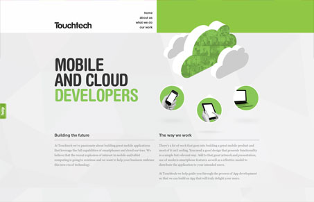
This site has a nice feel to it. It has a simple layout with plenty of space and a restrained color palette. The font choice (Helvetica Rounded) is suited particularly well to the subject matter. Along with the cloud graphic, it’s very soft and almost tactile (like a cloud?)
But while it’s clear they do something in regards to mobile development, the main headline is a bit confusing in that I’m not sure off the bat if this is something for developers or whether they are developers. It turns out it’s the latter. I would suggest perhaps changing the word ‘developers’ to ‘development’. Doing that might clear it right up.
I also find it a bit odd how the site actually functions. It doesn’t appear to be a side-scroller at first glance, but it is. And since a user might be just as likely to scroll down as they would be to click a link in the navigation, it’s important to take that into account since what happens if you click on a link is that it horizontally scrolls without taking the user back the top of the page. Which means it might scroll to the bottom of a page you’ve never been on, which is a bit confusing.
All in all those issues are minor in a site that is very well laid out and attractive.


Just noticed that the site also looks to be responsive. How do you feel about using the dropdown form element for navigation – particularly on an iPhone?
Beautiful site, seems like it is geared to the iPad / iPhone with swipe gestures!
Anybody know who made it?
I would assume the team that works at Touchtech did Phillip.
Hi,
Grafik in NZ made it, Mdigital helped with a wee bit of JavaScript. http://grafik.co.nz
Cheers,
Robin