
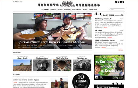
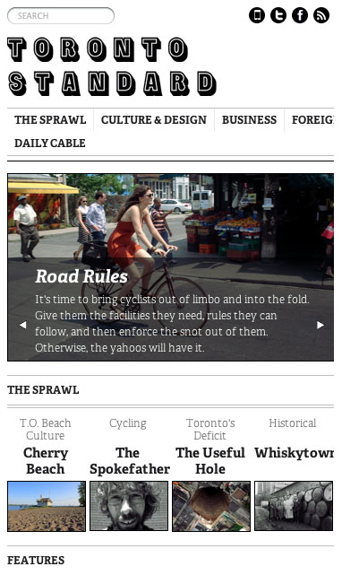
Damn I love seeing a responsive layout for a newspaper website. Seems to me to be the perfect use for this type of approach. This one happens to be very well executed design wise too. I love the feel that all the little details give on this design. The stark black and white, the almost unnoticeable illustrative elements make this site shine.




0 Comments