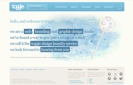
This is really one of the top sites i’ve reviewed in a while, it has simplicity and nice hand made illustrations to go along with a really great layout, probably my favorite combo. I really enjoy almost everything about this website. There is so much subtle detail in many places. For example; in the main navigation when you load a page, the subtle little squiggle under the page name, and the “top” anchor link that appears if the page gets to long. The journal is really smartly laid out, with the main blog posts getting special treatment and the “elsewhere” tweets and such being pushed to the right and getting similar treatment yet being different enough to make me notice it.
Glassmorphism: The Transparent Design Trend That Refuses to Fade
Glassmorphism brings transparency, depth, and light back into modern UI. Learn how this “frosted glass” design trend enhances hierarchy, focus, and atmosphere, plus how to implement it in CSS responsibly.


Gene again thanks for another interesting review and what a marked improvement on the presentation. I counted about 5 “you knows” but they weren’t noticeable and ONLY ONE nice, well done keep it up, and I agree with you about this site its is a very effective design on all counts
I hereby reserve the right to use the term “nice” at least once! 🙂