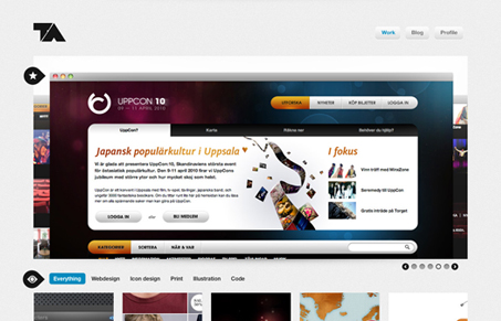
Yes we’ve featured Tobias Ahlin’s site before, this is V2, he’s updated it, slightly. First of all I loved his original site, but he’s come back to it with some simple changes. He’s lost the rounded edges, cleaned up some interactions and it’s still great. Some of you might not like it that he’s been featured twice with essentially the same site but I say, bah – it’s great, just enjoy it.
Glassmorphism: The Transparent Design Trend That Refuses to Fade
Glassmorphism brings transparency, depth, and light back into modern UI. Learn how this “frosted glass” design trend enhances hierarchy, focus, and atmosphere, plus how to implement it in CSS responsibly.


take it he likes this site – http://www.nosotroshq.com/
I think that’s a stretch ash… but Nosotros is indeed a bad ass site.
tobias ahlin, you are my idol. You work is just perfect, love it.