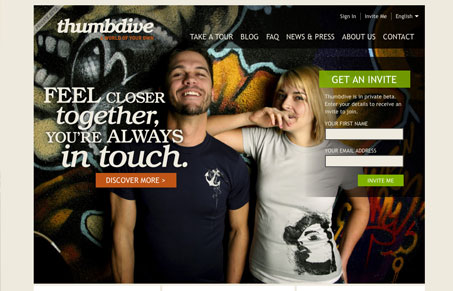
I love the large picture behind the main section of the page. The typography and visual rhythm in the layout/grid of this page is very well orchestrated. It’s really an amazingly simple design that’s made more complex by finely crafted type placement and details.
Glassmorphism: The Transparent Design Trend That Refuses to Fade
Glassmorphism brings transparency, depth, and light back into modern UI. Learn how this “frosted glass” design trend enhances hierarchy, focus, and atmosphere, plus how to implement it in CSS responsibly.


It’s so hard in today’s eye candy web world to get folks to distinguish between Photoshop fancy and solid design. Thanks for noticing!