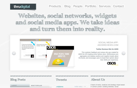
I really like the visual rhythm of this home page as you scan it from top to bottom. The large sections going down to the smaller squares really looks good, nice proportions too. I like the soft feel of the design mixed with the coolness of the grays. I also like the main three columns that make up the meat of this home page, that’s nicely done.
Glassmorphism: The Transparent Design Trend That Refuses to Fade
Glassmorphism brings transparency, depth, and light back into modern UI. Learn how this “frosted glass” design trend enhances hierarchy, focus, and atmosphere, plus how to implement it in CSS responsibly.


0 Comments