Submitted by: Jerome Iveson @thrivesolo
Role: Designer & Developer
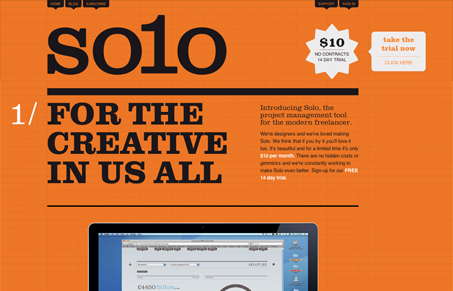
Solo the project management tool for the modern freelancer. Solo allows you to easily keep track of the day-to-day things that matter. Instant access to turnover, hours worked, deadlines and project progress. You get an easy to digest overview of your business and projects without having to pour over spreadsheets or fiddle with a calculator. Don’t get us wrong, it’s not a boring accounting package; it’s a beautiful tool to help you make informed decisions and increase your profits.
Love this site design, it’s just so different for a web app’s site, especially one for a project management app. Looking at the screen caps of the app itself it truly looks like a different experience and the website for it is as well.
I like the bold grid lines making up the background and the orange really makes the site memorable as a whole. I do think the main tagline “For the creative in us all” is a bit open-ended. I like the secondary tag-line “Introducing Solo, the project management tool for the modern freelancer” much much better. It superbly resonates the product and the site design so well, I wonder why the other is the main one?
Overall really interesting website design, i’d love to see some stats on conversion, etc…


Hi Gene
Thanks for featuring us. I’m currently designing the next iteration of our site. I’m getting rid of the first line as you suggest. Great minds think alike 🙂
I’ll fire over an email when the new design is live. I’ve tightened up the grid and added some other design elements.