Really superb website design in threadbird.com. From the subtle coloring to nifty typography I love this design.
Font-face is a plus with the nicely done typography. I especially love the footer layout. It’s bold and complete. The about us page is superbly organized as well and keeps you engaged with its interesting design details.


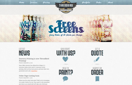
While this site has some nice things going on, it doesn’t quite hit the mark. It seems to be sitting somewhere between clean/simple and retro/grungy and as such it doesn’t really do service to either one. The textures are nice but there could be some more depth to them, and if there were a few more elements that broke outside of their containers, then that could really help draw the eye down the page. As it is, it’s a series of horizontal boxes that stretch all the way across the screen. I really like the type chosen for the logo and the ‘buttons’ beside the news, it definitely fits the vibe.
The footer, while a bit disjointed, seems to have had the most attention paid to it, and it definitely has some nice elements, like the ‘contact us’ element. I would like to see more hover states on some things, that would make them really pop.
I agree completely with you on the textures. The “grunge” part of the vibe of the site isn’t done justice, more depth there would really help.
However, I like the vertical rhythm to this design, I think the elements are spaced well and the type just fits really well in that.