
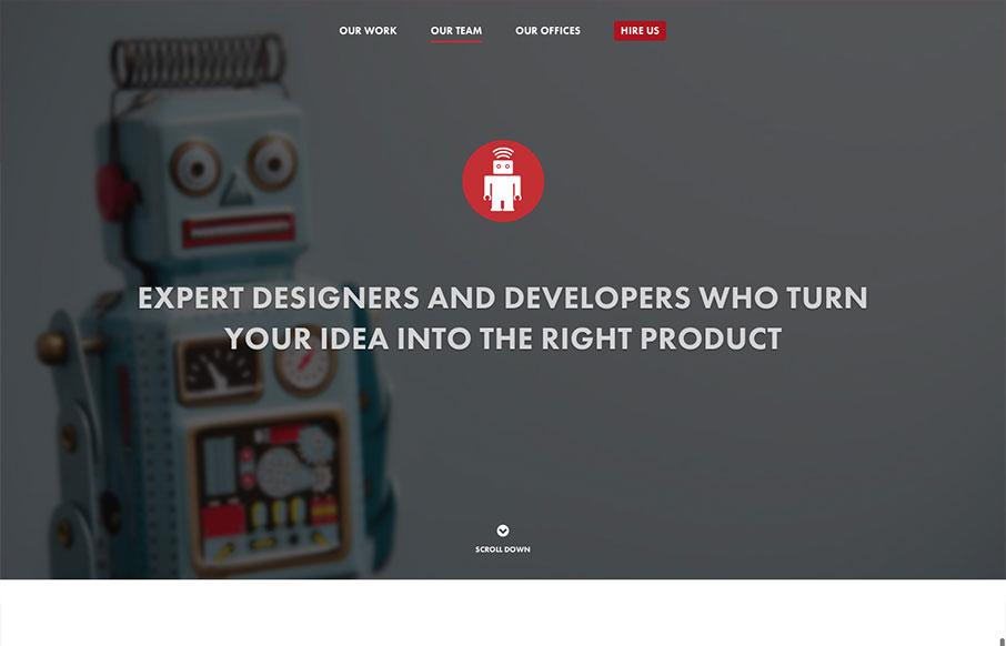
The Thoughtbot site is a really good experience. It’s simple and fast to browse and really feels like a “content” or “mobile” first approach. Which is interesting to me, since this is what they do, it’s a good idea to really show that off for potential clients and they’ve done that really well. I like the decisions they’ve made in the mobile to desktop changes in content on the site too. Really worth a study IMHO.


Fitts’s Law: Why the Easy Button Wins
Large, close targets are faster to hit than small, distant ones, that’s Fitts’s Law. A look at the 1954 rule behind buttons, prime and magic pixels, thumb zones, and dark patterns.


0 Comments