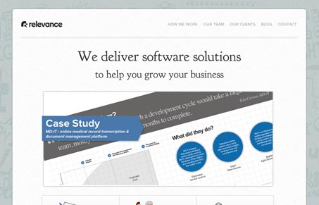
I like the mix of the illustrated parts and the clean design approach. It’s those subtle differences that make the details really stand out. Like the icons on the home page for their services. I particularly enjoyed the “team” page, I love how each person has a sketch that mouses over to their photo, it’s been done before yes, but those little sketches are just nice.


0 Comments