thinkluke.com

thinklukecom

Submitted by Luke Van Lathum @thinkluke
Role: Designer & Developer

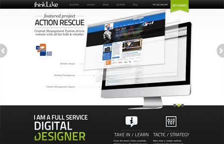
I really like the user of colour and space, the green is bold however it works will. It seems to have a mixed style between flat and web2.0.

I like the mixed visual style of this design. The large slidshow graphics really done up placed in-line with the other more flat elements on the page. THe fixed header/nav is cool, gives the mix of a single page design, but then you see that it’s not, the site has a good amount of content for a portfolio site too.

My favorite part is the quote form, there’s a nice clear call to action on all the pages that drive you to it, then the form itself is interesting. The slider for the budget is a really good choice visually for the form.

It all works really well together.

0 Comments

Submit a Comment

Your email address will not be published. Required fields are marked *

News & Articles

Looking Fast: The Art of Website Speed Perception

Looking Fast: The Art of Website Speed Perception

In the web world, technical speed and user perception matter. By improving design for a faster appearance, you boost conversions and stand out online. Speed isn’t just loading time; it’s perception.

Designing for Errors: Creating User-Friendly Contingency Plans

Designing for Errors: Creating User-Friendly Contingency Plans

Contingency Design hinges on empathy, understanding user frustration, and transforming errors into positive impressions. By embracing these principles, you enhance user experiences, retain customers, and boost revenue in the competitive digital landscap