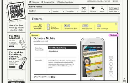
Jay and I both really like this site, you can hear more detail in our screen cast review of it. This site design is driven by a concept, that is the visual of a blueprint or plan and it comes off as really clever. There’s also some unique navigation choices made for the site, like the ability to switch between using your mouse and/or keyboard. We concluded that it’s likely try to bridge the gap between the tactile experience of using an iPhone in comparison to using a website traditionally with your mouse. We’re not sure if it’s really successful but overall like the idea of giving it a try and just being different with it. Pretty neat site and we both really enjoyed reviewing it.
Glassmorphism: The Transparent Design Trend That Refuses to Fade
Glassmorphism brings transparency, depth, and light back into modern UI. Learn how this “frosted glass” design trend enhances hierarchy, focus, and atmosphere, plus how to implement it in CSS responsibly.


the best looking / most clevar site i’ve seen in a very long time. A HUGE 10/10
Anyone find it ironic that a site dedicated to iPhone and other touch screen devices has a clever keyboard navigation scheme.
Well, well, well… if they were REALLY clever they would also think of us noscript users (and those that don’t have JavaScript support in the first place). Even if the site’s objective is probably a different matter I find it inacceptable that a website is barely usable without JavaScript enabled. If they were really clever they would at least serve a more basic version (in terms of functionality) where you can still browse the *entire* site.