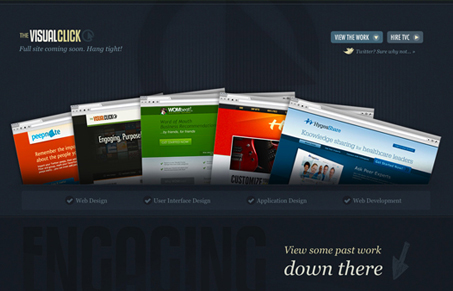
thevisualclick.com

thevisualclickcom

Pretty simple layout, but it looks great. Love the dark blue background and the lighter blue worked together and the lighter/brighter yellow highlight to make a really color combo. There’s something cool about keeping your site very simple like this and just providing a blog to communicate ideas.

Check out the blog too, plenty of difference there to keep it interesting:
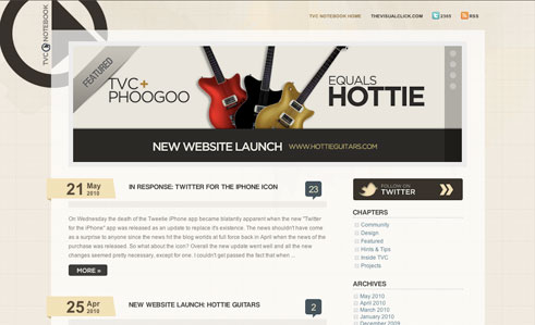
thevisualclickblog

0 Comments

Submit a Comment

Your email address will not be published. Required fields are marked *

Time limit exceeded. Please complete the captcha once again.

News & Articles

Website Scanning Patterns for Maximum Engagement

Website Scanning Patterns for Maximum Engagement

Discover how users visually process websites, the role of scanning patterns, content placement, and “the fold” Learn to design engaging pages with fast-to-consume content that aligns with user behavior.