
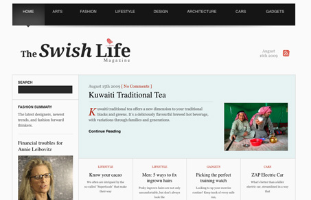
Really great open design for this site. I love the stark black and white design with such a strong grid. The typography is gorgeous and there are some truly fantastic details here to be discovered. The footer is also probably my favorite part. I do wish there was some differentiation between the different sections. The main nav has different colors for each section, it would be really striking if that color was brought into the main design for those sections. That’s minor but would make this design almost perfect in my opinion.


Fitts’s Law: Why the Easy Button Wins
Large, close targets are faster to hit than small, distant ones, that’s Fitts’s Law. A look at the 1954 rule behind buttons, prime and magic pixels, thumb zones, and dark patterns.


0 Comments