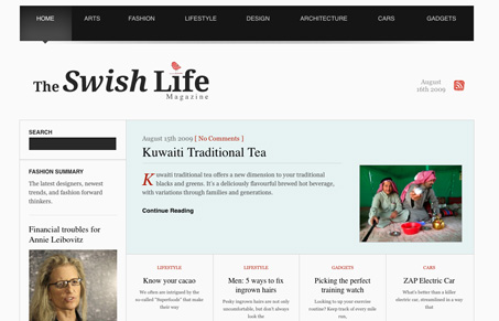
Really great open design for this site. I love the stark black and white design with such a strong grid. The typography is gorgeous and there are some truly fantastic details here to be discovered. The footer is also probably my favorite part. I do wish there was some differentiation between the different sections. The main nav has different colors for each section, it would be really striking if that color was brought into the main design for those sections. That’s minor but would make this design almost perfect in my opinion.
Glassmorphism: The Transparent Design Trend That Refuses to Fade
Glassmorphism brings transparency, depth, and light back into modern UI. Learn how this “frosted glass” design trend enhances hierarchy, focus, and atmosphere, plus how to implement it in CSS responsibly.


0 Comments