
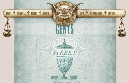
I love the Dantes Inferno inspired concept. The fixed navigation element being set off in the different color makes for a dramatic effect. The scrolling aspect to the site is well done here in my opinion, it actually adds a great deal to the overall design. The site would have less impact if it didn’t work this way I think.




It’s pretty overwhelming, but holy shit is that cool.