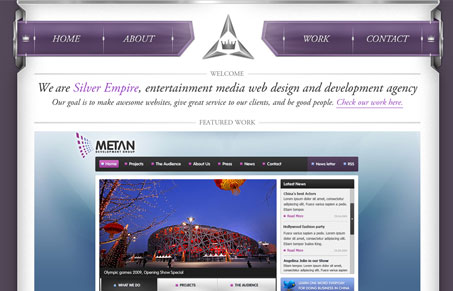
Really interesting looking website. I quite like it, it’s almost over the top, but never really goes over. I love the use of Garamond, it’s an often used typeface in graphic design but just feels unique here. I love it when someone can re-invent the use of something common. Pairing it up with this style of design is nice. I also like the bottom half of the site, the testimonial and usage of the the other brands really lifts up their own brand in all the right ways. Great work!
Glassmorphism: The Transparent Design Trend That Refuses to Fade
Glassmorphism brings transparency, depth, and light back into modern UI. Learn how this “frosted glass” design trend enhances hierarchy, focus, and atmosphere, plus how to implement it in CSS responsibly.


0 Comments