
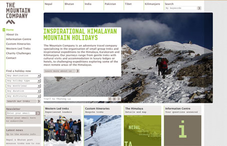
Pretty cool looking design. I love a lot of the design details on this site, the background stripes and the colors are great too. I’m a little confused over the hierarchy of the elements/sections as you scroll down the page, going from large to small to larger boxes doesn’t flow too well visually for me. But the great photography really makes up for a lot.




0 Comments