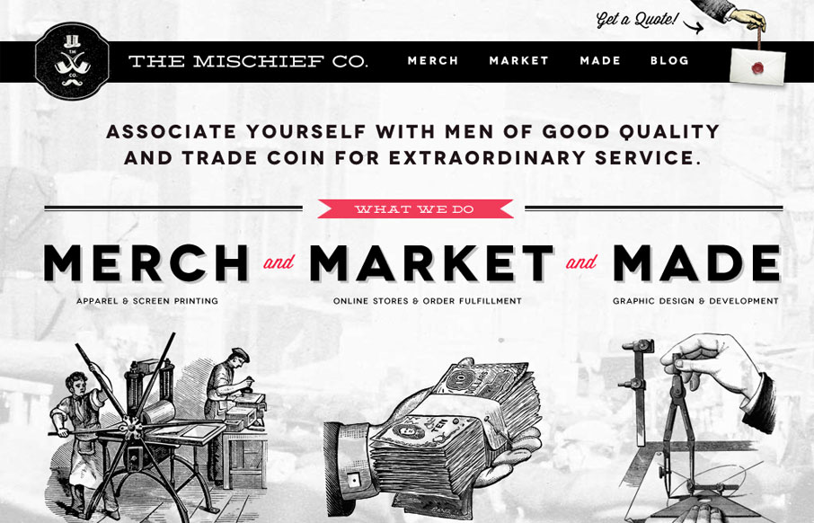
The Mischief Co’s visual branding is quite fun. It’s somewhere between olde school and future classy (heh, I just made that up.) But I love it, it’s fun and that’s just what a site like this needs right? Technically it’s put together well too. There’s also some nice interactive detail like with the fixed header/nav and the little wiggle the “get a quote” link has. The blog is both a fun read and visually fulfilling with the post detail images.


The Call to Action, Revisited
The Call to Action hasn’t changed in a decade, but the bar has. A fresh look at prominence, copy, mobile tap targets, and accessibility, with lessons from three major design systems.


0 Comments