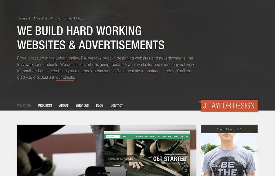
Nice asymmetrical layout, I really think the larger photo/work shot really helps bring a sense of focus to that section below the gray background/header area. The type is nicely treated visually and there is a solid rhythm as you scroll down the site. I don’t think the sub pages that continue the large header/text area are as successful content wise as the project page. I think it’s that smaller header taking up less space visually – I seem to want to ignore what’s in the text on the larger gray background section. Overall though, the layout is superb and I dig the background textures and other details used around the site. Good looking work!


Glassmorphism: The Transparent Design Trend That Refuses to Fade
Glassmorphism brings transparency, depth, and light back into modern UI. Learn how this “frosted glass” design trend enhances hierarchy, focus, and atmosphere, plus how to implement it in CSS responsibly.


0 Comments