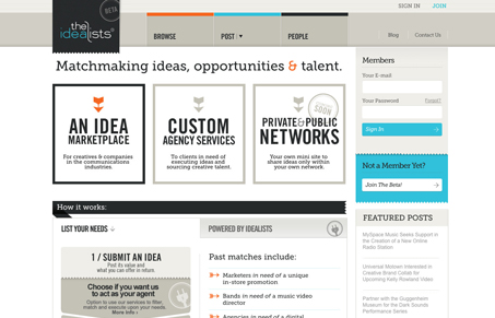
I love the visual style of this website. The really blocky yet very articulate lines and type all work together harmoniously to really give a great viewing experience. The site is so very text heavy but I just don’t feel it as I scroll down the page, it scans very easily and the hierarchy just seems to flow. I will say that the concept behind the site is a little complex to take in just from the home page. I think actually letting us see some of the case studies would be a great idea in the case of selling this idea more.


I’m not really crazy about this layout. It seems too… busy. Don’t get me wrong, the type is lovely, the color palate is spot on, and the various design details are all there (drop shadow, bordering, ridges, highlights, etc) but the website feels like a person who is jacked up on caffeine. Talking a mile a minute, cramming words in so fast that the listener can barely comprehend what is going on. Take a breath, get the copy streamlined, add some whitespace and then we’ll converse.