
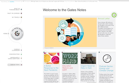
Lovely looking design on The Gates Notes. Both Jay and I love the look of this website. We do feel that the fonts are all a bit too small to be read easily. The overall design is unique and full of fine detail. Spend a couple of minutes and check out the screen cast review we did to hear all of our thoughts. But our final tally is two thumbs up on this design.




0 Comments