Submitted by Andy, @thecybertouch. Designer & Developer.
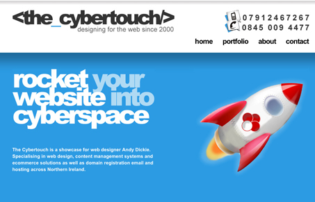
I like the large type and the tight letter spacing used there. I could really take it or leave it on the single page scrolling, I suppose if it wasn’t utilizing that it might work out to be less than exciting, but i’m not sold that it truly adds anything to the design in this case. I think the nice color and typography along with the illustrations sell this design enough to me. Good stuff.


0 Comments