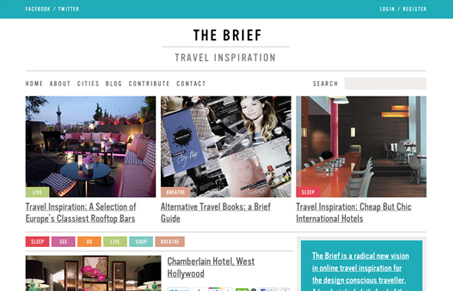
I love to see a website like this where it’s showing off just a ton of information and utilizes basics like size of images and density of content. It’s subtle here, the main column has large(ish) picture and a brief on each feature while the far right column is very densely packed and has darker backgrounds. If there’s anything i’m struggling with on this layout is i’m constantly going between the photos and the main title/headline – i’m not sure it’s totally a bad thing, just maybe some better contrast on the titles would make them really stand out, I can’t help but want to read them. Kind of like the title card next to a great painting in a gallery sort of deal.
Looking Fast: The Art of Website Speed Perception
In the web world, technical speed and user perception matter. By improving design for a faster appearance, you boost conversions and stand out online. Speed isn’t just loading time; it’s perception.


0 Comments