
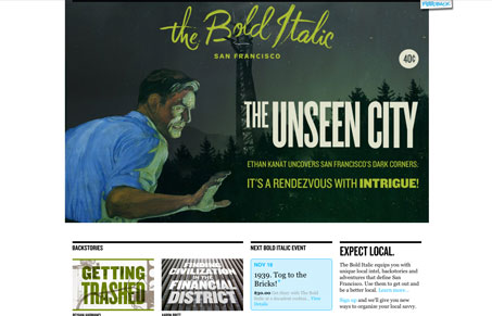
Really interesting site, it’s well written and chock full of neat info. On top of all that it looks really great, I love the blog-like feeling. The different “art directed” looking issues (I guess you call it) are a joy to look through, there’s no telling what you’ll find here as you slog through the site’s content. Really fun and great to look at.




I love their header and the use of the large condensed typeface. Not sure what that is. Looks like it could be Univers Ultra Condensed but I don’t think so. Anyhow, great site!
The little sidebar is a way to save articles. If you’re logged in, you’ll see little plus signs by article titles. Clicking that allows you to save it to one of the three sections.
@john – Cool, i’ll give that a try. They might want to think about adding something to that sidebar for people who aren’t logged in, it confused me a little. But that is a great detail to the site.
I agree. I just happened to stumble upon it myself.