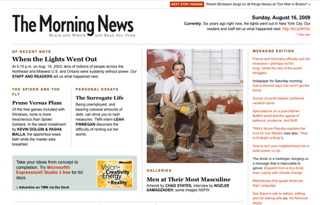
I’m not sure how new this design is, I feel like I’ve seen it for awhile since I occasionally end up on this site for some reason or another. That said, we haven’t featured it before and it’s just a beautiful site. The layout is very near perfect. There are three main features on the top left, and then an ‘art’ type gallery feature, then to the right are more ephemeral links and random stuff, leading down the page to more content. The spacing of the grid and the typography just really make everything easy to read and scan. The internal pages are also as well designed as the home page. A normal article or essay looks something like this and is set at just the right size with the right width and spacing. The way the galleries are treated is really nice, too.
Looking Fast: The Art of Website Speed Perception
In the web world, technical speed and user perception matter. By improving design for a faster appearance, you boost conversions and stand out online. Speed isn’t just loading time; it’s perception.


0 Comments