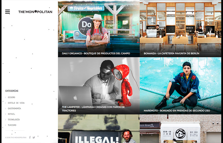
The Monopolitan

http://www.themonopolitan.com/

Pretty cool blog/news site layout. I like the basic grid and imagery. The hamburger nav with the nav items that only show once you click it seems a little unwarranted. Just my humble opinion, I don’t like to hide things the user needs unless there’s a reason. There may be here, but I can’t figure it. At any rate it’s a beautiful website visually and works seamlessly.

From the Designer:

Bases in Mexico, The Monopolitan is a global briefing covering international business trends and ideas.

Submitted by: Juan Pablo Gomez
Twitter: @themonopolitan
Role: Owner
Country: Mexico

0 Comments

Submit a Comment

Your email address will not be published. Required fields are marked *

News & Articles

Sign-Up: Enhancing Conversions through good UX

Sign-Up: Enhancing Conversions through good UX

Optimize your website’s sign-up process by focusing on clarity, ease, and user mindset. Clearly explain the purpose, benefits, and steps, and use social proof to build trust and drive conversions.

The Essential Guide to Getting Started on Freelance Writing

The Essential Guide to Getting Started on Freelance Writing

Explore the lucrative and fulfilling world of freelance writing with our essential guide. Learn about specialties like blogging, social media, article, and technical writing. Build a portfolio, find work, set up your business, and discover the potential earnings. Embrace the freedom of working from home and follow tips for success in your dream career.