
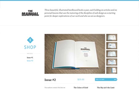
We’ve reviewed The Manual website and even the book itself before on UnmatchedStyle. I really enjoyed the first issue and have loved the second even more. The website is a simple exercise in design, using concise and clear elements mixed with some small details show’s the craft involved. Love it when you swap from issue 1 to issue 2 and the blue turns to read – that’s the type of thing i’m talking about. Love it!




0 Comments