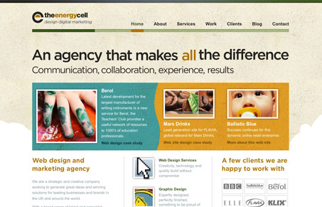
Submitted by Dave Whitehead – Designer & Developer.
I think this submission is a worthy candidate as not only does it have an original, attractive design and is easy to use, the whole site passes Strict XHTML validation.
First impressions when I arrive on this site are good, so half the battle is won already! I am staying for a look around, definitely the sign of effective design. A warm and appealing colour palette combined with a strong & consistent typographic style with some image replacement goodness making use of a visual hierarchy drawing the eye slowly down the content works well. I like the use of flash on the homepage strapeline, and the fact that the others are static indicates a good balance between drawing the eye and usablity/accessibility issues. Very clear navigation bar at the top. I particularly like the strong services sub menu which focuses on what this company offer. Might be nice to have clearer indication of where I am on the site though, some visual persistent navigation clues within the services section or titles might help. They have made use of breadcrumbs but only in the portfolio? Which brings me nicely to the portfolio layout which is excellent, it is a triumph and the use of the computer monitor while not original has been done well. The information is very scanable.
The footer offers easy to see calls to action and there is an obvious tie in between header and footer marrying the whole page together. The white swirls contrast beautifully with the well balanced grid layout. I like the icons with the faint shadow, who said drop shadow is dead!
Weaknesses:
Although the review is about design, design is about usability and a poor implementation of wordpress as the blogging platform can impact negatively on this. A rewrite module is a must for friendly URL’s .Weak design of sidebar in blog section when compared to all other aspects of design on the site makes me think it was a bit of an after-thought. Site built with DW templates (sorry I’m a handcoder and a snob! lol)


Great site all round